Middle-Earth Journey
Dec 2025
A journey through Middle Earth — interactive mini website about Tolkien's world. Click locations on the map, scroll to their story. Built in Framer for my Immersive Experiences class.
Overview
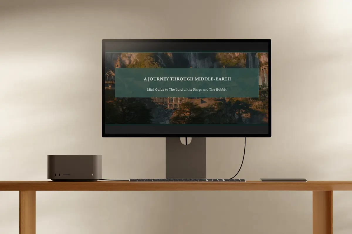
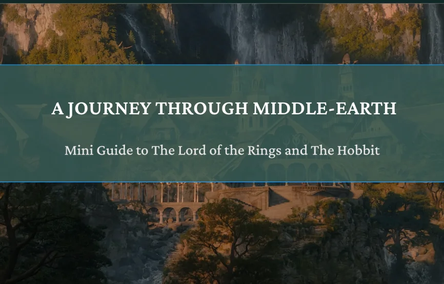
A Journey through Middle-Earth is an interactive mini website that guides users through key locations from Tolkien's Lord of the Rings and The Hobbit. Built in Framer as a final project for my Immersive Experiences I Design class at UVU, the site centers on an interactive map where clicking a location scrolls you to a detailed card about that place.
I'm a big Lord of the Rings fan, and I wanted to make something that helps people understand where the story is set — the geography, the scale, and the character of each place — in a way that feels immersive rather than encyclopedic.
Research & Direction
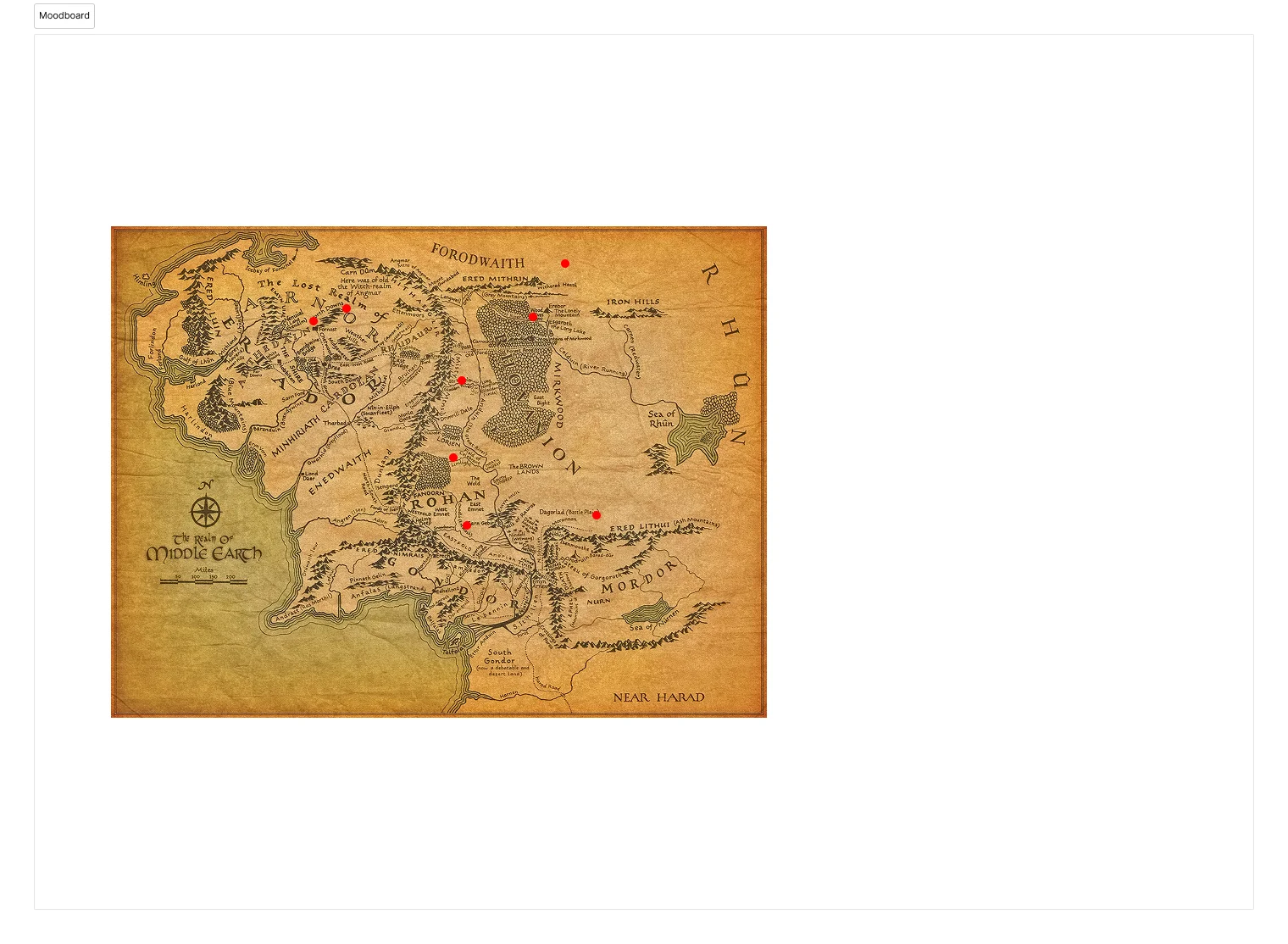
I started with mood boards to define the visual language. I wanted the site to feel like opening an old book — warm, textured, and grounded in the world Tolkien built. That led to a palette of deep teals, muted golds, and parchment textures that reference old cartography without feeling kitschy.
From there I mapped out which locations to include and how to organize them. I chose eight places that span both The Hobbit and The Lord of the Rings: The Shire, Rivendell, Lonely Mountain, Mirkwood, Helm's Deep, Mordor, Minas Tirith, and Mount Doom. Each one needed to feel distinct while fitting into the same design system.
Sketches & Exploration
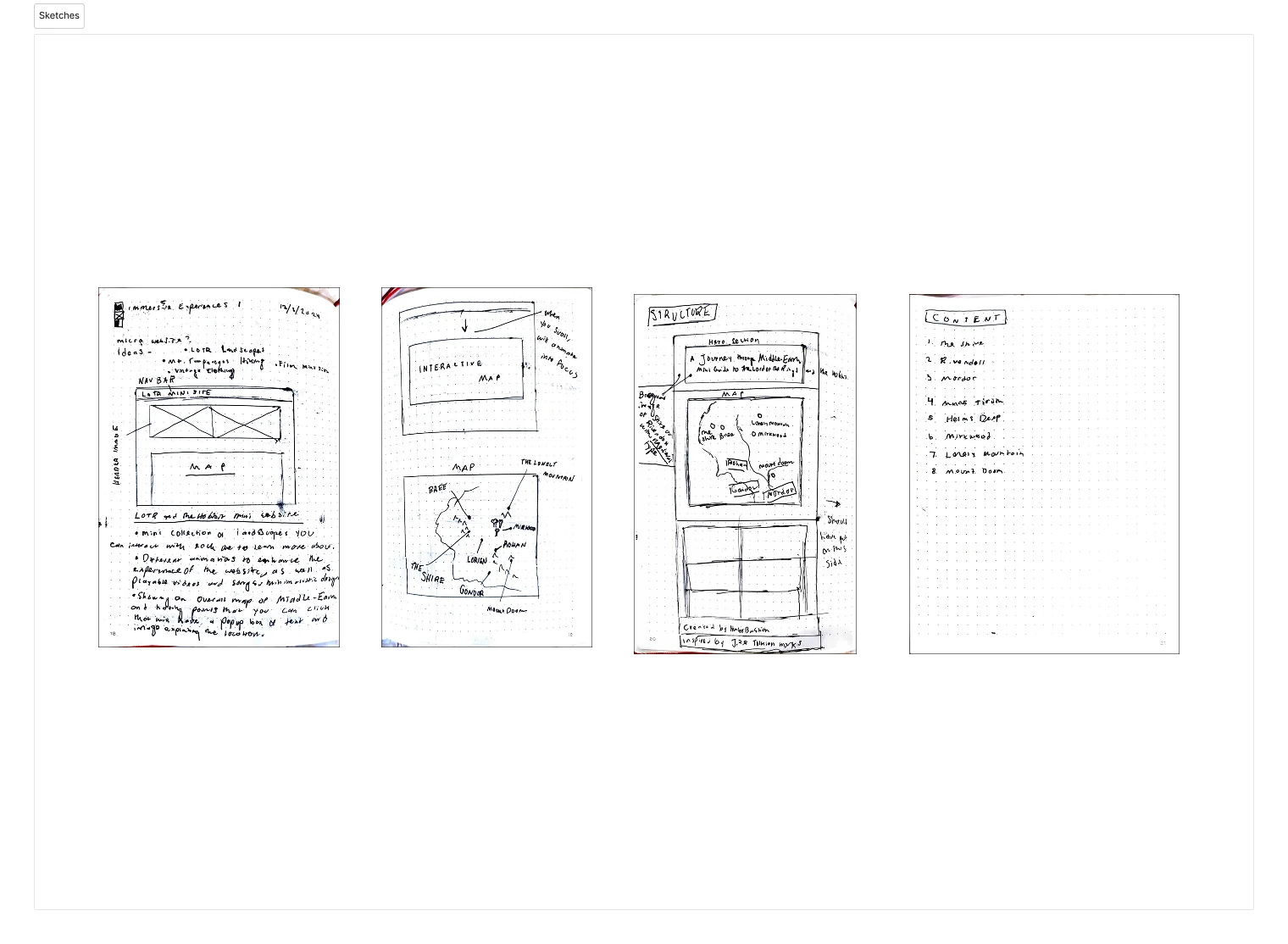
Early sketches focused on how the map interaction should work — how to surface location names on hover without cluttering the map, and how clicking should transition the user to the detail view. I explored several navigation patterns before landing on the scroll-to-card approach, which felt the most natural for an exploratory experience.
How should the map navigation work?
Chosen direction
The Interactive Map
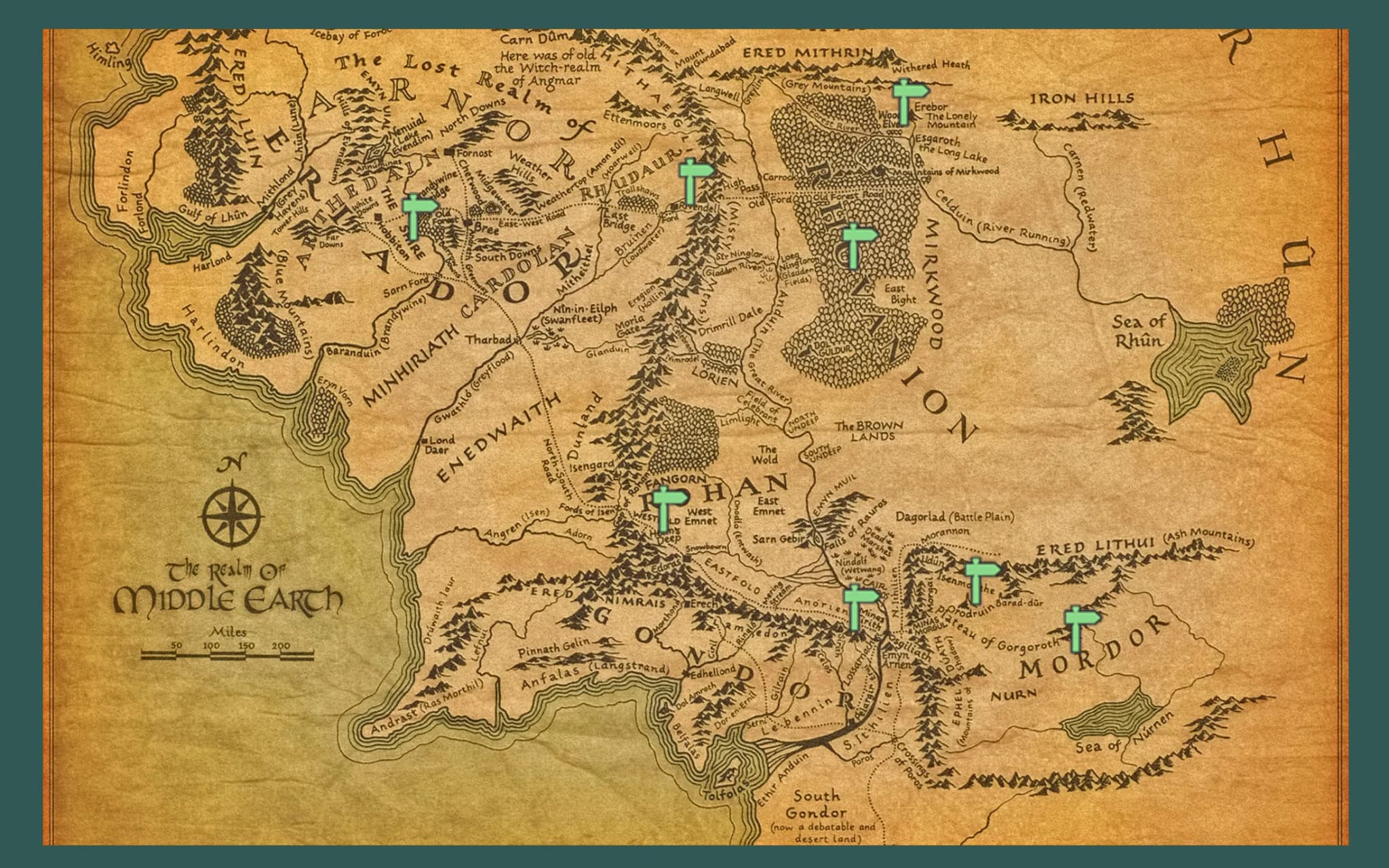
The centerpiece of the site is a full interactive map of Middle-Earth. Hovering over a location reveals its name, and clicking scrolls the user down to a detailed card for that place. Each card includes a landscape image, a short description, and a tag showing which films or books the location appears in.
The map uses subtle pin animations on hover to invite interaction without being distracting. I wanted the experience to feel like discovery — you find things by exploring, not by reading a list.
Visual Design
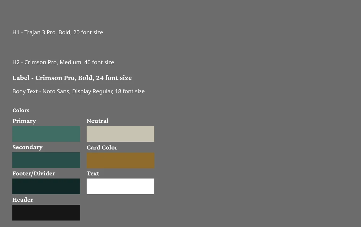
The color palette pulls from the films and the source material: deep forest greens for the background, warm gold for interactive elements, and desaturated landscape photography for the location cards. Typography stays restrained — the content and imagery do the storytelling, not decorative type.
Each location card follows the same structure: a header with the place name, a landscape photograph, a one-line description in quotes, and a pill badge indicating whether the location appears in The Hobbit, LOTR, or both.
What visual direction captures Tolkien's world?
Chosen direction
What I Learned
This was my first real project in Framer, and it taught me a lot about prototyping interactive experiences quickly. Framer's component system let me iterate on the location cards fast — I could change the layout of all eight cards at once and see the result immediately.
If I were to revisit this, I'd probably rebuild it in code. Framer was great for iterating on ideas and getting the interactions right, but code would give me more control over the map behavior and let me add things like animated scroll transitions between locations. The constraint of Framer did force me to keep the interactions simple, which ended up being a strength.
Outcome
The map-first approach ended up being the right call. People explore at their own pace instead of reading a wiki, and the cartography aesthetic ties the whole thing together in a way that a card grid never would have.