Lumo
Mar 2026
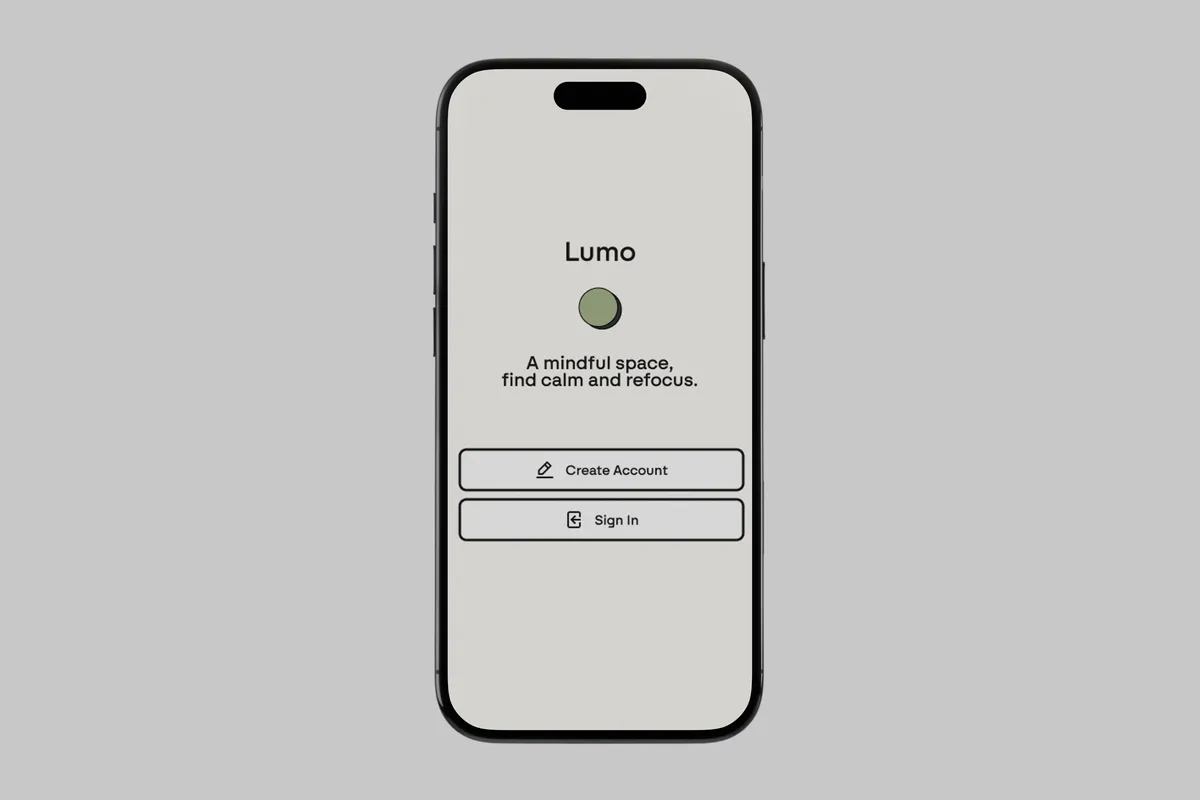
A mindfulness app designed to help users find calm and refocus. Clean, minimal interface with a soft natural palette.
Overview

The Problem
Fitness and wellness apps feel noisy and competitive — reflection gets skipped. People want to get outside more, but cues and feedback loops are weak. It's hard to see whether outdoor time actually improves mood or energy because mood journaling lives in one app and fitness tracking in another.
The Goal
Design an intuitive interface that promotes consistency without overwhelming the user. Habit tracking meets wellness awareness in a peaceful, distraction-free environment. The experience should feel calming, intentional, and private.
Three pain points surfaced early:
- Fitness apps feel noisy and comparative, killing motivation
- Too many taps and permissions to start and end a simple session
- Mood journaling is separate from activity — no clear correlation between what you do and how you feel
Research & Direction
Competitive Analysis
Looking at what other apps were doing helped give direction to where Lumo could stand out. AllTrails is a hiking app for tracking stats and finding new places. How We Feel is a mood tracking app. Taking inspiration from both, the goal was to make an app that could be reflective while you either hike or mood track — connecting activity to reflection in one place.
Research Questions
- How do users naturally reflect on their day or mental state?
- What makes a mindfulness or journaling app feel calm and easy to use?
- How do users prefer to track progress without feeling overwhelmed?
Methodology
Conducted usability testing using a low-fidelity prototype in Figma with a small group of family and friends. Participants were asked to complete tasks such as logging in, choosing a focus, journaling, and checking goals and milestones. Observed their interactions, recorded paths, noted confusion points, and collected feedback.
Insights
Three friction points discovered through usability testing shaped the final design.
Chosen direction
Chosen direction
Chosen direction
Design System
A 6-color palette and Swiza type scale kept the visual language calm and distraction-free across the whole app. Reusable components — hamburger overlay, nav bar, and back button — were built so every screen stayed structurally consistent without redesigning from scratch.
Responsive Design
- Mobile first: Single-column layout keeps the experience focused for on-the-go logging and reflection
- Tablet & desktop: Expanded panels give users more breathing room to review and engage deeply at home
Designed across 3 platforms including mobile, tablet, and desktop to explore how Lumo scales. Mapped 10 screens covering onboarding, journaling, focus mode, and settings. Kept fidelity intentionally low at the wireframe stage to prioritize flow and structure over visual polish.
Final Design
The high-fidelity prototype represents the final visual and interaction design for Lumo. It demonstrates key flows including improved graphics and refinement across Rewind, Focus, Journal, and Goals screens.
Reflection
The direction I went with Lumo was solid, but looking back I could have pushed it further. One idea: Lumo could adapt an AI interface — using a model like Claude to proactively help with logging your mood and suggesting how to make your day more reflective. A conversational companion that meets you where you are instead of waiting for you to open an app.
Core Insight
Lumo's purpose serves as a companion for navigating the digital age — providing mood tracking, journaling, and goals in one calm space. Designing from scratch taught me how to balance user needs with constraints, and when to simplify a feature rather than build it out. The core insight driving every decision: reflection is easier when it's tied to action.
Work together
Interested in this kind of work?
View my resume or send a quick note about a similar project.